3 Underrated Lightroom Color Tools for Landscape Photos

When it comes to editing landscape photos, most of us fall into familiar habits. We’ve got our go-to steps, our favorite sliders, and a general look we like to achieve. There’s nothing wrong with that—consistency is important. But Lightroom has a deep set of tools, especially for working with color, that often get skipped simply because they’re either hidden or not part of the typical workflow.
In this post, I’ll walk you through three underrated color tools in Lightroom that can make a big impact on your landscape images. I’ll also share a few tips to help you avoid common mistakes when using them.
Starting With a Clean Foundation
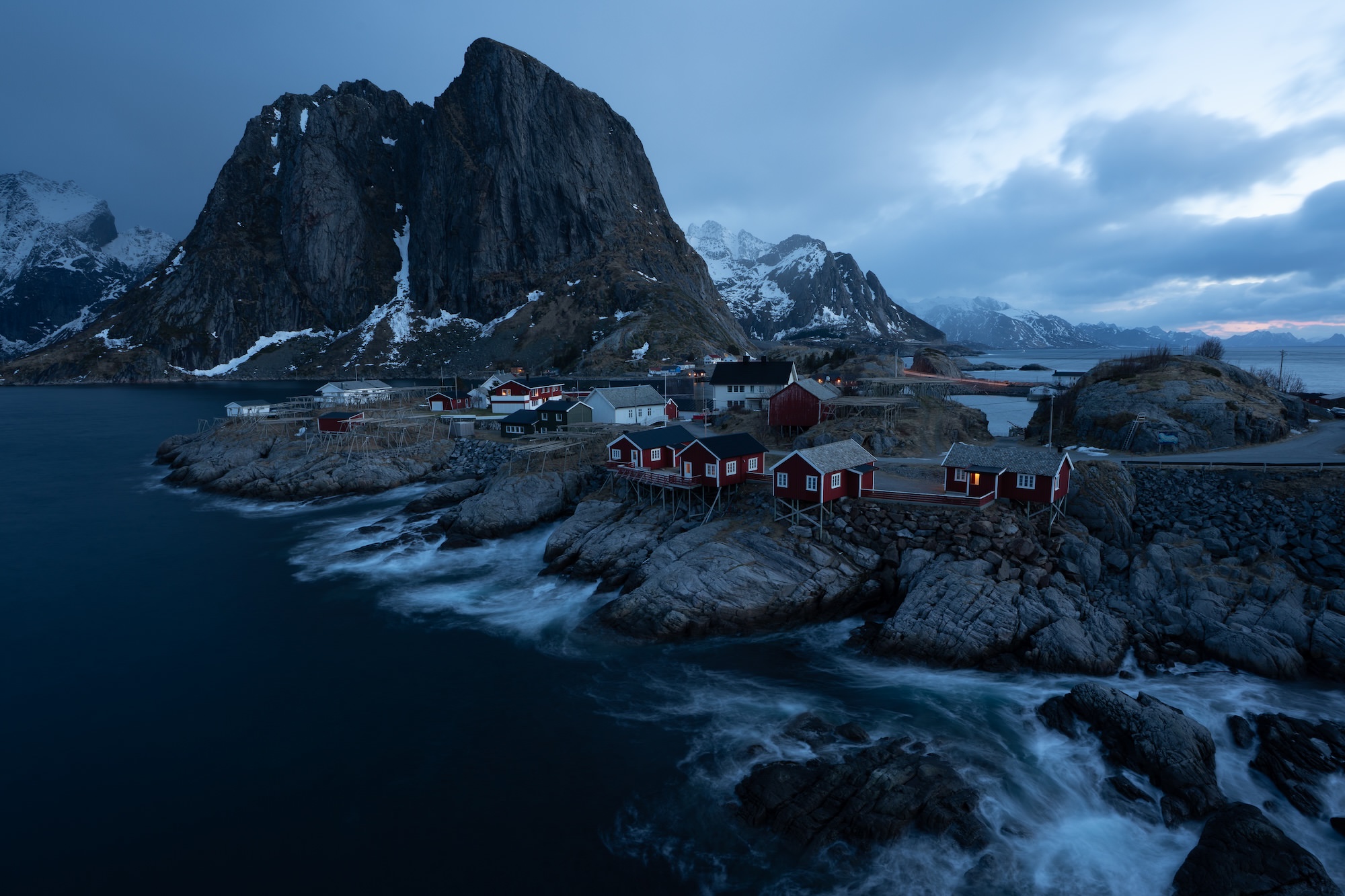
Before diving into color work, I always make sure I’ve got a solid starting point. For this example, I used a photo from the Lofoten Islands in Norway.
Here are the key setup steps:
-
Crop for composition – I usually lock the aspect ratio unless I’m preparing the photo for something specific like Instagram.
-
Correct lens distortion – Enabling lens corrections is especially important for wide-angle lenses to remove vignetting and barrel distortion.
-
Set a custom white balance – Using the eyedropper tool on a neutral area (like a whitecap in the water) helps remove color casts and gives a more natural look.
-
Apply an Adobe Adaptive Profile – These profiles are available for supported RAW or DNG files and provide a great tonal and color starting point.
With those steps done, I’ll usually fine-tune the exposure, shadows, and contrast (often using a custom S-curve for better control than the contrast slider provides). One extra tip here: use the Refined Saturation slider under the Tone Curve to manage any unexpected color shifts caused by contrast edits.
Now that we’ve got the image in a good place, let’s look at those three underrated color tools.
1. Color Calibration (a.k.a. Camera Calibration)
If you’re using Lightroom Desktop, this panel is hidden by default. In Lightroom Classic, it’s always been at the bottom of the Develop panel. You’ll need to manually enable it from the toolbar menu if it’s not visible.
Within this panel, the Blue Primary Saturation slider is one of my favorite tools for landscapes. Increasing it can bring out all the colors in your image with a kind of richness that’s hard to replicate with other sliders. I’ll also adjust Green and Red Primary Saturation, but usually with a lighter touch.
This tool changes the color values at the pixel level across the entire image—not selectively—so it impacts the overall color tone in a unique way. It’s especially useful for natural scenes where you want to make the environment feel more alive without over-editing.
2. Point Color (Especially When Used With Masks)
Point Color was introduced in Lightroom in the 2023 update. On its own, it’s powerful—you can sample a color in your image and precisely edit its hue, saturation, and luminance.
But it becomes even more useful when paired with masks. For example, I used an Object Mask to select the red cabins in the image and then refined just those reds using Point Color. With the Visualize Range option turned on, you can clearly see what parts of the image you’re affecting, and then refine that selection using the range sliders.
This method lets you be incredibly specific. You’re not editing all reds in the image—just the reds in your masked object. That makes your adjustments feel more intentional and avoids color spill.
3. Color Grading
Color grading has replaced the old split toning panel and added the ability to affect shadows, midtones, and highlightsindependently. While the tool is powerful, it often intimidates users because of its “three-wheel” interface.
To simplify:
-
Start with one region (like highlights or shadows), and switch to the single-wheel view so you can see the sliders.
-
Pick a hue (like a warm orange for highlights) but remember: nothing will happen until you increase the saturation.
-
Always judge the result by looking at the image, not the slider values.
-
Use the luminance slider to adjust how visible you want the color grade to appear.
For my edit, I added a warm orange to the highlights and a cool blue to the shadows. The result is a subtle but pleasing contrast that adds mood without overpowering the scene.
Don’t forget the Blending and Balance sliders at the bottom of the panel:
-
Blending controls how much separation there is between your shadow and highlight colors.
-
Balance lets you push the grade more toward the shadows or the highlights.
Final Touches
With the main color work done, I wrapped up the image with a few finishing steps:
-
Adaptive Sky Mask – A bit of dehaze brought out more detail in the clouds.
-
Foreground Mask – Added texture and clarity, then pulled back the dehaze slightly for brightness.
-
Sharpening – Used the Alt/Option key while adjusting the masking slider to limit sharpening to edges.
-
No vignette this time, though that’s sometimes a final stylistic touch.
Here’s a quick before-and-after using the backslash key.
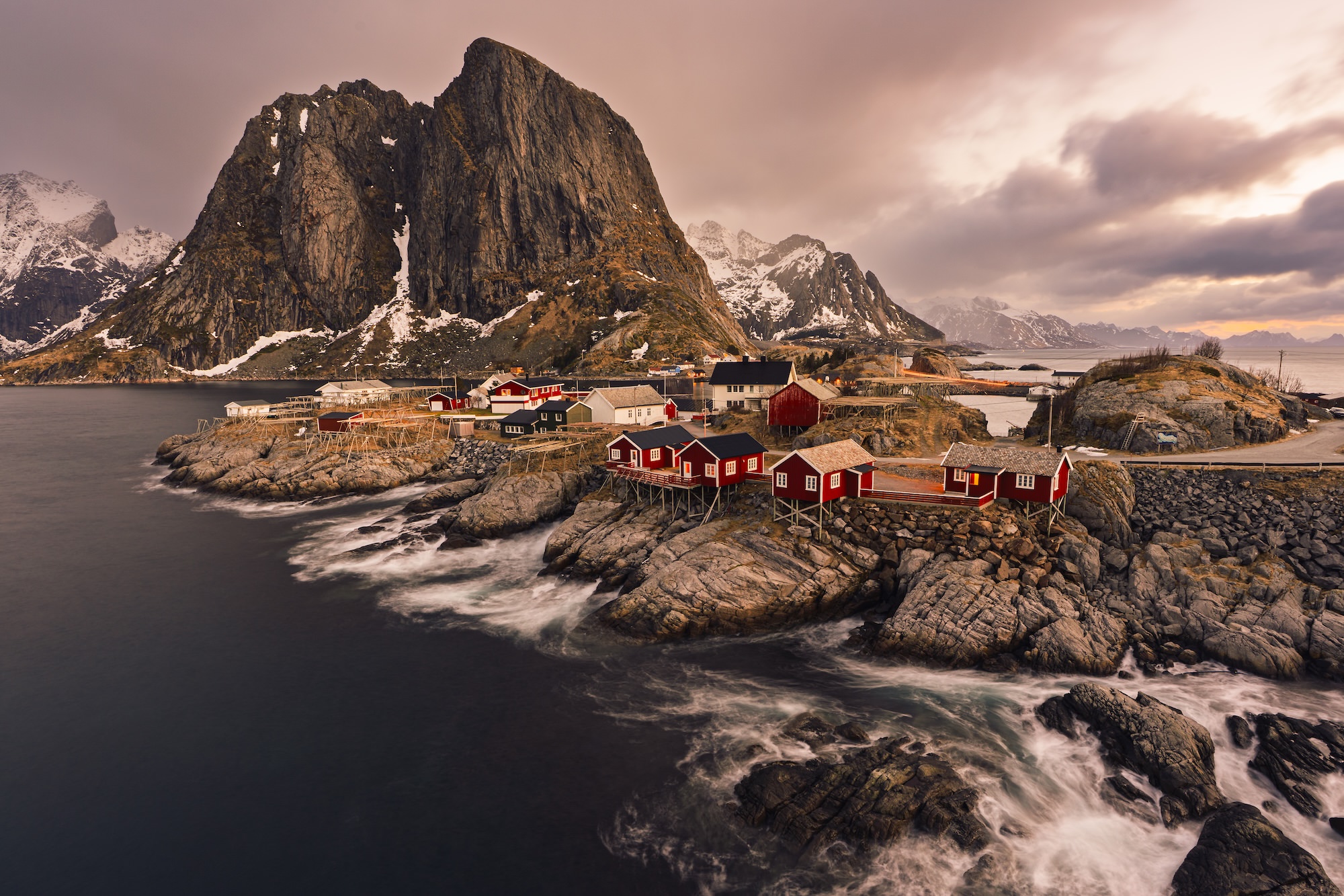
The result is a vibrant, balanced landscape with more intentional color throughout—thanks to three tools that often get overlooked.
Why This Matters
Lightroom has evolved. The tools are there, but they won’t make an impact unless you use them intentionally. Tools like Color Calibration, Point Color with Masks, and Color Grading aren’t just for advanced users—they’re for anyone who wants to develop a deeper, more personal editing style.
If you want to dig deeper into these tools, I’ve got separate articles that break down Color Calibration and Point Color in more detail.
Get Even More Out Of Your Landscape Editing Workflow
If you want to dive deeper into landscape photo editing and develop a streamlined, creative workflow using Lightroom, check out my course, Lightroom Landscapes. With over four and a half hours of lessons, it’s designed to help you master these techniques and more.
The Only Course Designed to Help You Use Lightroom Everywhere!


